-

You’re invited to view David Reid Home Canterbury’s brand new showhome, located on the corner of Highsted Rd and Glenturret Dr in Christchurch on Saturday and Sunday from 10am-4pm.
The architecturally designed showhome was designed with families and entertainers in mind, and sits in a commanding position at the entrance of the new Highsted Residential subdivision.
While based on one of the plans from David Reid Homes’ Lifestyle range, David Reid Homes Canterbury director Chris Swann says they worked closely with an architectural designer to customise the home to create a unique, modern, free flowing home with plenty of space for family and friends.
“At David Reid Homes we focus heavily on design and quality craftsmanship to create unique homes that leave a lasting impression and match our clients’ lifestyles.”
“This showhome is a perfect example of using our extensive plan range as a starting point and adding some architectural features to really make it stand out from all the other new home builds out there.”
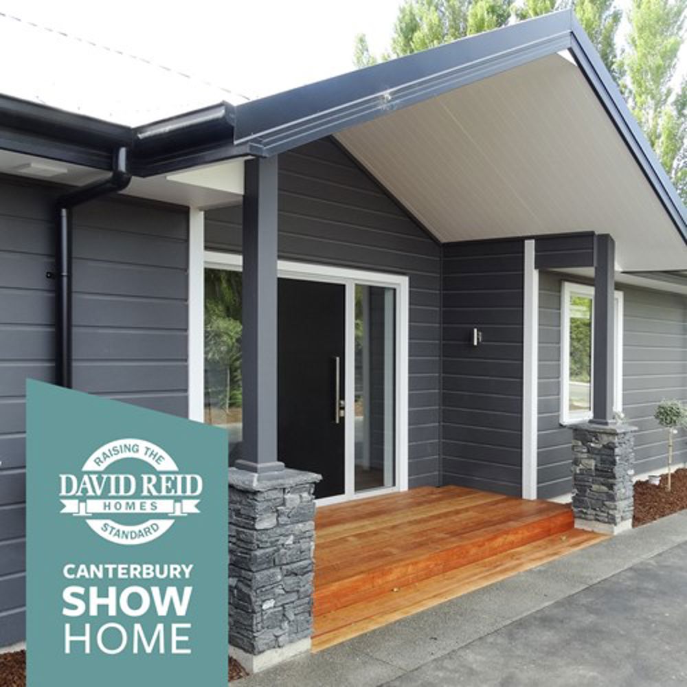
Unique design features include a 2.5 metre stud, vaulted ceilings that impart a feeling of light and space, his and her walk-in wardrobes in the master bedroom and Linea Oblique Weather Board cladding - the latest innovative damage resistant, rot resistant, fire resistant cladding system from James Hardie, off-set with designer schist masonry.
The David Reid Homes team also worked closely with interior and exterior design agency Comber and Comber to develop the aesthetics for the showhome.
We chatted to interior designer Sam about their approach to creating the simple, elegant look and feel that catches the eye from the street and flows right through the home.

What is so special about the new home?
When the plans initially came through we could tell it differed from common building company show home layouts. Big open spaces, grooved cathedral type ceilings and interesting angles were all components we loved.
The location is on a prominent entry site in the Highsted Residential Subdivision. The exterior needed to have a point of difference, to be an attention grabber, while appealing to a large audience. I wanted the interior to resemble the exterior as I believe the flow from one to another is very important.
I love how the floor to ceiling windows on the north-side of the house allow you to experience the landscaping in full view – and the greenery really pops off the dark Dulux ‘Castlecliff’ on the weatherboards.
What was the feel & aesthetic you wanted to achieve?
Classy, simple, clever and impressive!

The home is a sophisticated and generous design so the colours and furnishings needed to be reflective of this. The layout would accommodate entertainers, large families and retired couples (one end of the house could serve as a separate guest wing), so we wanted this to feel like a home anyone could see themselves comfortably living in.
Instead of a commonplace stark white scheme, the colours are modern, fresh and a little daring. I saw this as an exciting opportunity to be more than just another Christchurch showhome. I wanted the house to feel interconnected - outside to in, one side of the house to the other.
The dark feature wall in the lounge feels inviting, with a more formal feel from the rest of the house without being stiff. The house also has a sense of playfulness which is not obvious from the outside.
Why does it work so well?
There are so many stages to creating a show home. If one stage does not work, this can jeopardise the success of the entire project. The trades hired for this job were amazing - this house is about detail and it was finished to perfection.
Also, we were really lucky the team at David Reid Homes stood behind our vision and gave us freedom to create something unique. They were really easy to communicate with from the start and this great relationship lead to a great result.

As experienced designers we provided guidance from the beginning, and have been involved through the different layers that help build up to the end. It is important to understand the layers need to work in harmony and support one another as opposed to competing.
Not only were we responsible for colours and flooring etc but the staging at the end. Staging with furniture and accessories is a great way to put that personal mark on a home and I think the selection really identifies with the feel we were trying to achieve from day one.
What is your favourite part?
My favourite part of the show home is the entry space. I think an entry should excite and pull you in to discover the rest of the house. The feature pendant we used is one of my all time favourite pieces – the Web Etch Pendant by Tom Dixon and the shadows that it casts across the beautifully angled ceiling is quite magical.
The kitchen (as we found out on suppliers night) is a great place to host, gather and chat. It has a wonderful sense of openness.
Welcome to David Reid Homes Canterbury Showhome

Filed under:
- Inspiration